Wednesday, 9 November 2011

Composition

I think I accidentally went over this a bit in my last critical studies post, so hopefully I won't be repeating myself too much here. To quote Dictionary.com, ' the act of combining parts or elements to form a whole'. This is true in the sense of a painting, everything in the frame must have a purpose and add to the whole. The way a painting shows the elements within it gives the painting different connotations.

The problem with many artists paintings is that they start without thinking through the composition. If you just start drawing things in randomly without any thought, it won't be a very good painting. There are different compositional rules which can be used to help.

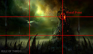
Here are some basic compositional ideas. Firstly the rule of thirds. This is where if you break up a picture horizontally and vertically into thirds, the places where the lines cross are good places to out a focal point.


Another one that can be used is implied forms, This is where a series of forms lead the eye to the focal point. There can be a variety of ways to do this, such as using a circular, or triangular forms.


Another very simple rule of composition is to use the cross. This is where two lines cross the page, with the horizontal line acting as the stopper and the vertical one leads the eye. All of these rules are about leading the viewers eye to the main focus of your painting.


A main area of interest needs to be created by the painting. When painting a picture, we need to think of what is the most important part and make this the focus. Some rules for making the area of interest stand out are making it have:
'
  • The strongest color and if possible complementary colors.
  • A strong shift in value contrast (Light-dark or vice versa)
  • Preferably, not essentially, it should take up a good portion of the picture plane and gradually become subdued while withdrawing.
  • Man made structures, animals or human figures will further enhance the center of interest. They take the role of main actors.
  • The subordinate and surrounding elements should direct or lead the viewer to that center of interest by means of pointers and visual paths. See fig 1 &2.
  • It should not be placed in the center nor halfway in the picture, preferably in any of the 1/3 portions.
  • This area should not be blocked, not even partially. This will diminish its importance.
  • An effectively designed center of interest will grasp and hold the viewer's attention. '
This can be seen in some older classic paintings. For example, if we look at this painting ( the Thaw, by Fyodor Vasilyev) we can see that the people are the main focal point. This is because they are human which draws the eye, and also there have the greatest contrast against the snowy background. They are also at around a third of the page, so they fit into the rule of thirds as well.


This guidelines can be used to make effective artwork and paintings.


references:
http://dictionary.reference.com/browse/composition
http://photoinf.com/General/Johannes_Vloothuis/landscape_composition_rules.htmlhttp://www.cgsociety.org/index.php/CGSFeatures/CGSFeatureSpecial/phil_straub_composition_tutorial
http://www.artexpertswebsite.com/pages/artists/vasilyev.php

Tuesday, 8 November 2011

Vehicle Design

This week in visual design, we were designing a vehicle. this vehicle had to be modern day, so nothing too futuristic, and could be of any type. This was a really broad description, so it was a little difficult to get started. I liked that it was modern day, because it seemed more grounded in the real world, and it gave me place to start.

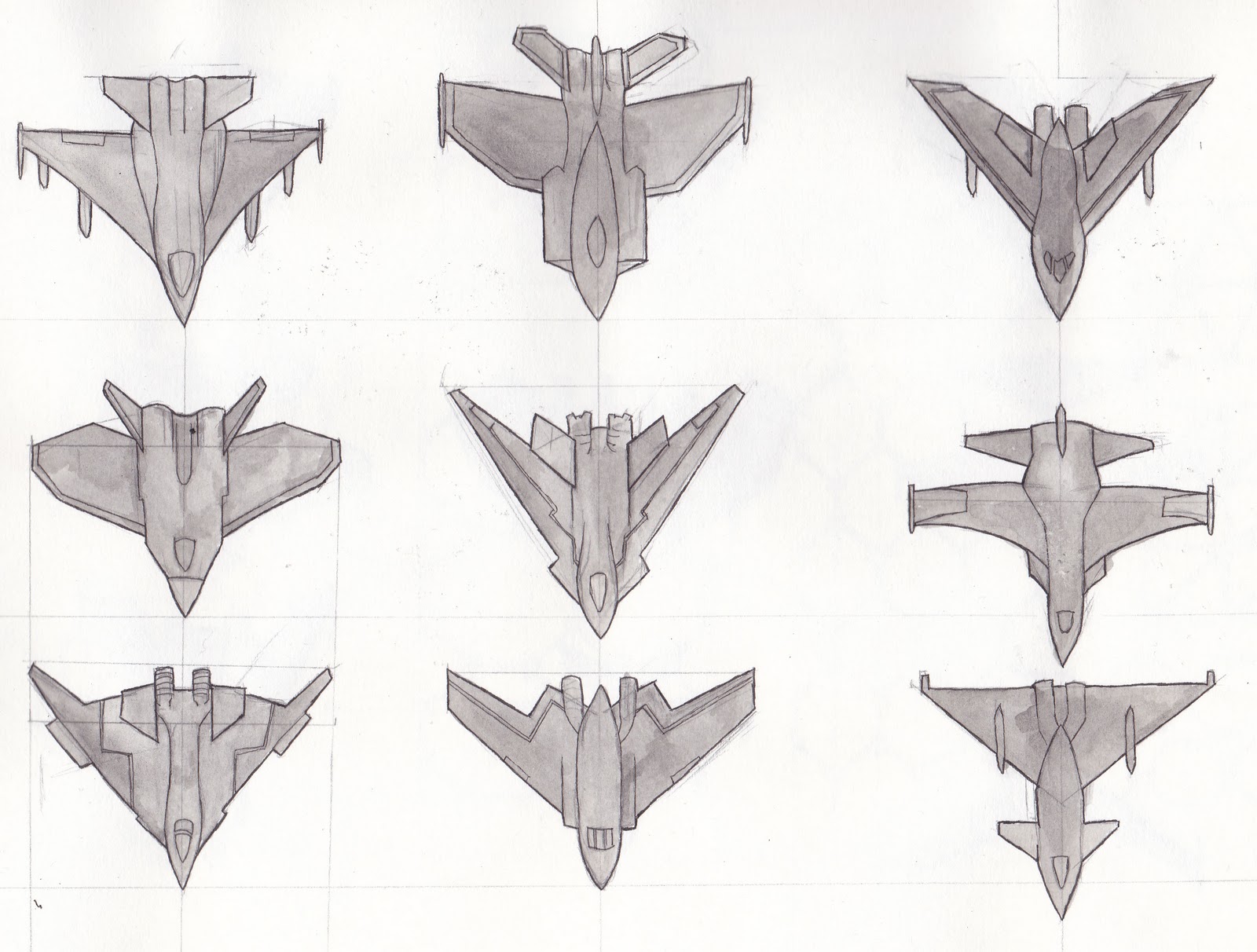
I wanted to create a fighter jet for this project, pretty much because they look interesting. I started off looking at the ones that already exist, sketching them out to get a feel of how they were put together. The final design had to look realistic and as if it could work in the real world. I then created lots of different plane shapes. These sketches are simple because I wanted to see how  the overall shape worked. I chose the last one because I though the triangular shape looked the best.


It was around this time that I thought of something else to add to the design; the jet could have adapted camouflage. This would disguise it from people on the ground and other craft. However, I didn't want the plane to be invisible. Instead I thought that it could be covered in scales that changed colour depending on its surroundings, like a chameleon. This would mean that the jet would be visible to some extent. I tried out different shapes of these scales, and chose the hexagonal ones. I also created orthographic drawings before some compositions for my final piece.


I wanted to do two final pieces because I couldn't decide between showing the jet from above or below. Only this one is finished at the moment.


 I'm still a little behind. Although I now have my computer back, my tablet is broken. There's now a new one on its way, but this has been a stressful year so far. Hopefully no more technical problems will befall me in the rest of this year.

Thursday, 27 October 2011

Treasure chest


It’s the first of the three 3d projects we’ve got this semester. I’ve been posting so much about visual design that it seems strange to be writing about game production. This project was where we were given a piece of concept art and were to build a model from it. This was the painting we were given:


And this is a render of my model:


I tried to keep things similar to how the concept looked, even though we were allowed to change things. The legs were the trickiest things to do, as they are a fiddly shape. I’m not 100% happy with the texturing though, I think I could have unwrapped the model better and packed the UVWs more efficiently. I also made a little environment, a cave, to put my finished chest in.


After this project, the next one is the trash project. I’m going to try to build this one quickly, so I have time to build the most difficult model, the self portrait.

Tuesday, 25 October 2011

Bradgate Park


This week we were off to Bradgate park. We’ve been there the previous years, and it’s always been cold, but this time it was alright weather wise. I got a taxi over, but it was expensive, the driver got lost and I got there late. Had to run up the hill to catch up with everyone else (not a good way to start a Monday morning). So it was the bus back and I’ll get the bus again in the future.

Sketch wise, I could have got a little more. I have the twelve thumbnails, but we spent a lot of time walking around the park and the nearby woods. There was some impressive old slate quarries in these woods, but unfortunately they were extensively fenced off, razor wire and everything. It’s a shame because this cut off the view and I would have liked to have drawn these areas.

The day was a little dull lighting wise, but it got more interesting as they day went on. Some people were down there earlier and saw the sunrise, which must have looked fantastic. We’re allowed to change stuff around in this project, which I probably will do in my final piece so I might mess with the lighting (I’ll post it up after its painted)


New Walk Museum Final

Finally up to date with these blogs and my artwork :)

Loughborough Station Final

Here is my final for loughborough station:

Monday, 24 October 2011

Concept and Planning


Concept artist. Lots of people when they start this course, myself guilty included, wanted this to be their job. But not many people understand the job fully. They see the wonderful paintings that are produced by these artists and want to do the same without realising the process that goes on behind it. The finished products are only usually the things on display, without the mountains of research and planning being viewable to the public.
Concept art is used to show an idea through a visual medium. It needs to convey the right message to the viewer. This is especially difficult; a good piece of concept art shows for example a characters personality or the mood of the scene just by the way they have been painted. Subtle things such as pose, composition, lighting, ad colour help give an impression of what a person or place is like without even saying a word. Good art can tell a story to the viewer.
Behind the finished product, a concept artist has to put in a lot of planning. Skipping out this stage is fatal; lots of people (again guilty) start of a large scale painting without much thought. They just start painting then wonder why it doesn’t turn out right. A key thing to remember is that just because you have spent a lot of time on a painting doesn’t necessarily mean it will be good. This is why planning is important, as you need to sort out tricky things like composition to make a drawing work before you start painting in the detail. This is also why we do prep sketches in visual design, to get us used to planning out our work. The early stages in developing a painting are the most important.
Bringing up composition again, it’s very important to make it strong. Even the most interesting subject can look bland if the painting is composed poorly. In year one we did not spend that much time on composition, we pretty much drew what was in front of us. This year we need to produce drawings that are more dynamic. A good composition leads the eye to the points of interest in the painting. For example this site has lots of examples of compositional rules that work.
For example, the rules of thirds. This is where, if the drawing is split into thirds horizontally and vertically, where the lines meet are the points of interest in the painting. Placing the focal points on these intersections will make the painting more interesting. There are also other rules, but I find this one the easiest to use.
Getting this right is key for producing effective concept art. A concept artist will spend a good amount of time drawing lots of quick sketches to work this out before refining the image. Things such as colour and value are also important in a painting. The eye is usually drawn to the part of the image with the highest contrast. Colour is important for setting the mood of a piece and giving it atmosphere.
Time management is key for getting all these sketches done. For my own time management, I don’t think I’m too bad, although I do waste a bit of time on the internet or just generally faffing around. This year I am trying to invest a lot more time into my work, this year is really key in preparation for the third year.