Thursday, 24 November 2011
Update
Ah haven't written one of these in a while. Just going to give an update generally about how my work is going, because I've missed out a lot of others. Many I think this is because of the character project, I had to start it again because it wasn't good enough and now I feel very pressed for time. Everything else has been put on the back burner. But yeah, I'm going to try and catch up on some critical studies first off.
Last week, I finished the trash project. I think this turned out alright. I'm not going to repeat what I've put on my design document, but rather I'm going to say my personal feelings on these projects. For me, this project took way to long. I was trying to start off the character project at the same time and I don't think it was very productive for both projects. Can't believe it took 3 weeks to make a pile of trash, I'm quite disappointed with my time management.
I also started the urban environment project in visual design. This is where we draw outdoor places in Leicester city. I've got the sketches done, but I'm about a week behind in visual design. I've decided which thumbnail I want to use to paint the final piece ( the fountain with the pigeons). I've also got another project to finish, the war of the worlds sculpting project. I've got a bit of the model done, but its long legs are a pain, and it's not at a good enough quality to put in the oven yet, I'm just not happy with it.
I've been trying to keep up with my gesture drawings and also my 30 minute speed paints, but honestly other things have been taking priority. I do think they will help me get better though, so I will continue them once I have the time. Honestly I don't know if this is the computer and tablet problems catching up with me, or if I haven't been organising my time properly. I have been working every day and missing the films to catch up but I still seem to be behind, but I guess I need to push myself harder. I'm just hoping I can get everything finished in time for Christmas and the formative assessment.
Tuesday, 15 November 2011
First guest lecture
Last week on Thursday we had our first guest lecture, from codemasters. The person who came in to talk to us was Mitch Small , who was previously a student on the course. As well as a lecture on concept art and misconceptions about being a concept artist, there was a half a day long workshop. This work stressed the importance of doing lots of thumbnails, the importance of silhouette and producing things quickly.
The tutorial was about producing an alleyway scene. I don't have anything to show because I got lost at the white boxing stage and couldn't work out what had been done with the different renders. But I see now that in visual design I should produce more rougher and quick drawings when designing something. Next time we get a project like that I'm going to speed up my work process and draw a load of small thumbnails.
war of the worlds
this last week, I've been working on the war of the worlds project for visual design. We've been designing the tripods, the walking machines of the Martian invaders. In the book, they are described as:
'Seen nearer, the Thing was incredibly strange, for it was no mere insensate machine driving on its way. Machine it was, with a ringing metallic pace, and long, flexible, glittering tentacles (one of which gripped a young pine-tree) swinging and rattling about its strange body. It picked its road as it went striding along, and the brazen hood that surmounted it moved to and fro with the inevitable suggestion of a head looking about. Behind the main body was a huge mass of white metal like a gigantic fisherman's basket, and puffs of green smoke squirted out from the joints of the limbs as the monster swept by me. And in an instant it was gone'
I've tried to keep as close to this as possible in my designs, although I have been influenced by other designs, for instance, the designs in the art book that came with the musical, as well as the designs in the most recent movie.
I've kept the tentacles, and I tried to think of the physiology of the creatures that built it.
This project was a lot of fun, as I really enjoy scifi novels and this is one of my favourites.
Wednesday, 9 November 2011
Composition
I think I accidentally went over this a bit in my last critical studies post, so hopefully I won't be repeating myself too much here. To quote Dictionary.com, ' the act of combining parts or elements to form a whole'. This is true in the sense of a painting, everything in the frame must have a purpose and add to the whole. The way a painting shows the elements within it gives the painting different connotations.
The problem with many artists paintings is that they start without thinking through the composition. If you just start drawing things in randomly without any thought, it won't be a very good painting. There are different compositional rules which can be used to help.
Here are some basic compositional ideas. Firstly the rule of thirds. This is where if you break up a picture horizontally and vertically into thirds, the places where the lines cross are good places to out a focal point.
Another one that can be used is implied forms, This is where a series of forms lead the eye to the focal point. There can be a variety of ways to do this, such as using a circular, or triangular forms.
Another very simple rule of composition is to use the cross. This is where two lines cross the page, with the horizontal line acting as the stopper and the vertical one leads the eye. All of these rules are about leading the viewers eye to the main focus of your painting.
A main area of interest needs to be created by the painting. When painting a picture, we need to think of what is the most important part and make this the focus. Some rules for making the area of interest stand out are making it have:
'
- The strongest color and if possible complementary colors.
- A strong shift in value contrast (Light-dark or vice versa)
- Preferably, not essentially, it should take up a good portion of the picture plane and gradually become subdued while withdrawing.
- Man made structures, animals or human figures will further enhance the center of interest. They take the role of main actors.
- The subordinate and surrounding elements should direct or lead the viewer to that center of interest by means of pointers and visual paths. See fig 1 &2.
- It should not be placed in the center nor halfway in the picture, preferably in any of the 1/3 portions.
- This area should not be blocked, not even partially. This will diminish its importance.
- An effectively designed center of interest will grasp and hold the viewer's attention. '
This can be seen in some older classic paintings. For example, if we look at this painting ( the Thaw, by Fyodor Vasilyev) we can see that the people are the main focal point. This is because they are human which draws the eye, and also there have the greatest contrast against the snowy background. They are also at around a third of the page, so they fit into the rule of thirds as well.
This guidelines can be used to make effective artwork and paintings.
references:
http://dictionary.reference.com/browse/compositionhttp://photoinf.com/General/Johannes_Vloothuis/landscape_composition_rules.htmlhttp://www.cgsociety.org/index.php/CGSFeatures/CGSFeatureSpecial/phil_straub_composition_tutorial
http://www.artexpertswebsite.com/pages/artists/vasilyev.php
Tuesday, 8 November 2011
Vehicle Design
This week in visual design, we were designing a vehicle. this vehicle had to be modern day, so nothing too futuristic, and could be of any type. This was a really broad description, so it was a little difficult to get started. I liked that it was modern day, because it seemed more grounded in the real world, and it gave me place to start.
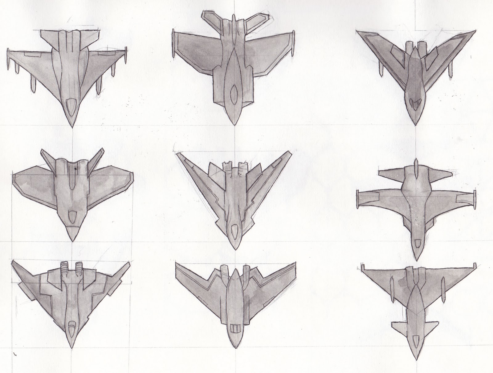
I wanted to create a fighter jet for this project, pretty much because they look interesting. I started off looking at the ones that already exist, sketching them out to get a feel of how they were put together. The final design had to look realistic and as if it could work in the real world. I then created lots of different plane shapes. These sketches are simple because I wanted to see how the overall shape worked. I chose the last one because I though the triangular shape looked the best.
It was around this time that I thought of something else to add to the design; the jet could have adapted camouflage. This would disguise it from people on the ground and other craft. However, I didn't want the plane to be invisible. Instead I thought that it could be covered in scales that changed colour depending on its surroundings, like a chameleon. This would mean that the jet would be visible to some extent. I tried out different shapes of these scales, and chose the hexagonal ones. I also created orthographic drawings before some compositions for my final piece.
I wanted to do two final pieces because I couldn't decide between showing the jet from above or below. Only this one is finished at the moment.
I'm still a little behind. Although I now have my computer back, my tablet is broken. There's now a new one on its way, but this has been a stressful year so far. Hopefully no more technical problems will befall me in the rest of this year.
Subscribe to:
Posts (Atom)